The mark
From the fully drawn key to the final solution: the head of the key takes the place of the O in Casiamo. The symbol disappears inside the name instead of sitting beside it, and it also works on its own as a social icon.
Casiamo Srl
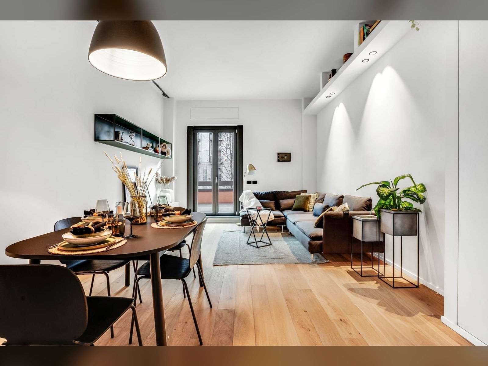
The project
Casiamo does turnkey home renovations, but its brand had fallen behind: a generic pictogram and colours too light, indistinguishable from any other building firm. They asked us to redo the logo, find a payoff that sticks, and design the interface of the new site. Development is by William Bardon, a web designer who works with us; the look and behaviour of the pages we designed ourselves in Figma.
We kept the red, the only genuinely recognisable part of the old mark, and paired it with a dark grey for depth and a white for cleanliness. Then we worked on the symbol starting from a simple idea: the key, the moment the house becomes yours. We went through four proposals, from the fully drawn key to the final solution, where only the head of the key takes the place of the O in Casiamo. That is the move that convinced everyone: the symbol disappears inside the name instead of sitting beside it, and it works on its own as a social icon. From the mark we then derived a pattern that holds all the printed materials together. For the payoff we started from a list of images, metamorphosis, rebirth, the blank canvas, and arrived at "Casa nuova, casa mia". It works because it repeats the word for home in two different ways and because the possessive pulls the listener in. The typeface is Lato, chosen because it carries both the mark and the website text.
What we made
From the fully drawn key to the final solution: the head of the key takes the place of the O in Casiamo. The symbol disappears inside the name instead of sitting beside it, and it also works on its own as a social icon.
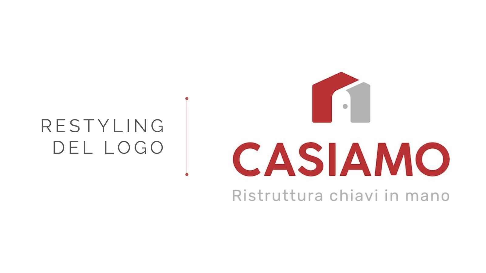
The starting point. A generic pictogram, colours too pale, nothing memorable: it blended in with any other building company.
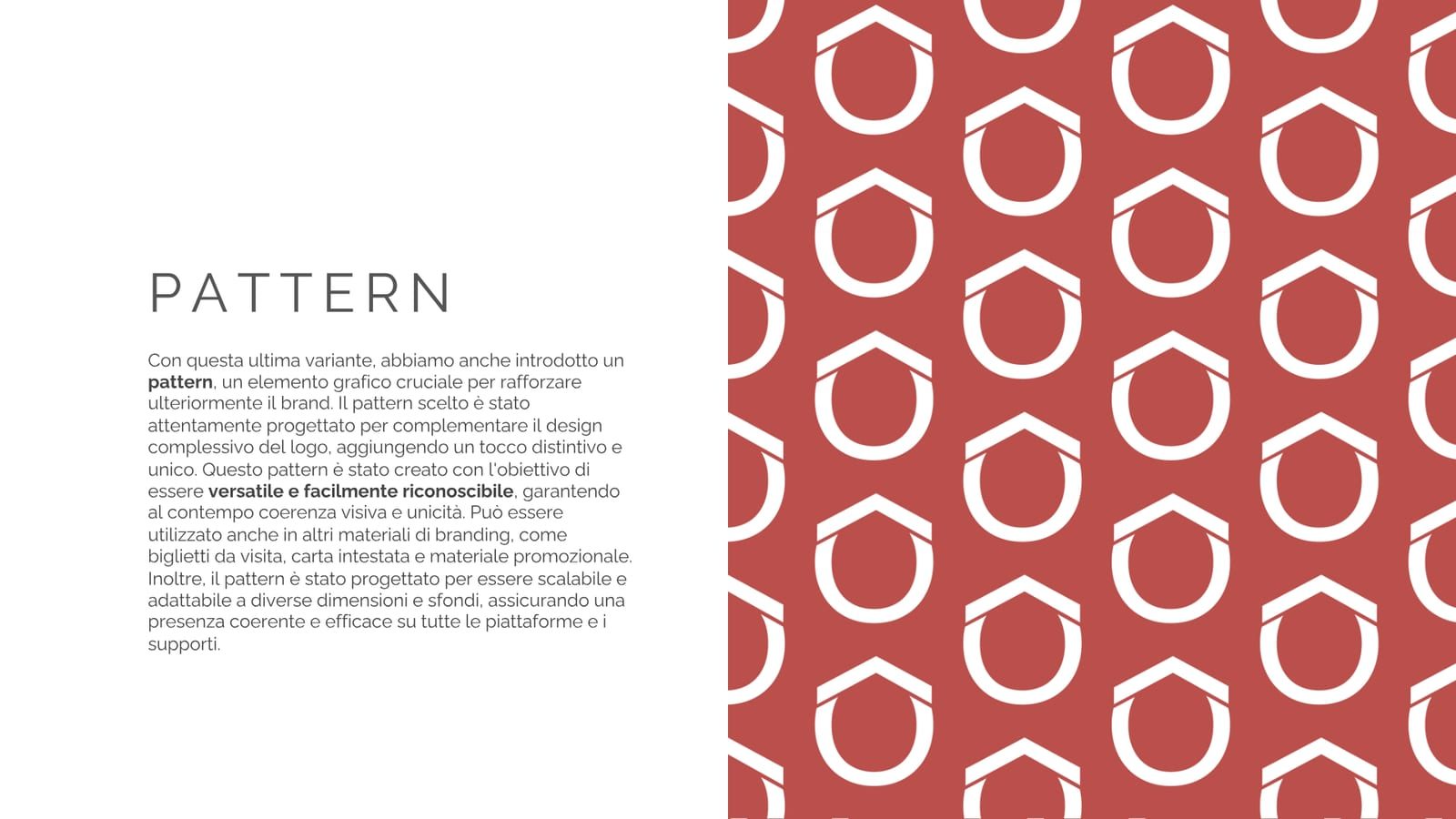
From the mark we derived a pattern that holds all the printed materials together. It comes from the hexagon of the key, so it is not added decoration but a piece of the mark itself.
"Casa nuova, casa mia". It repeats the word for home in two different ways, and the possessive pulls the listener in. Short, rhythmic, easy to remember even when spoken.
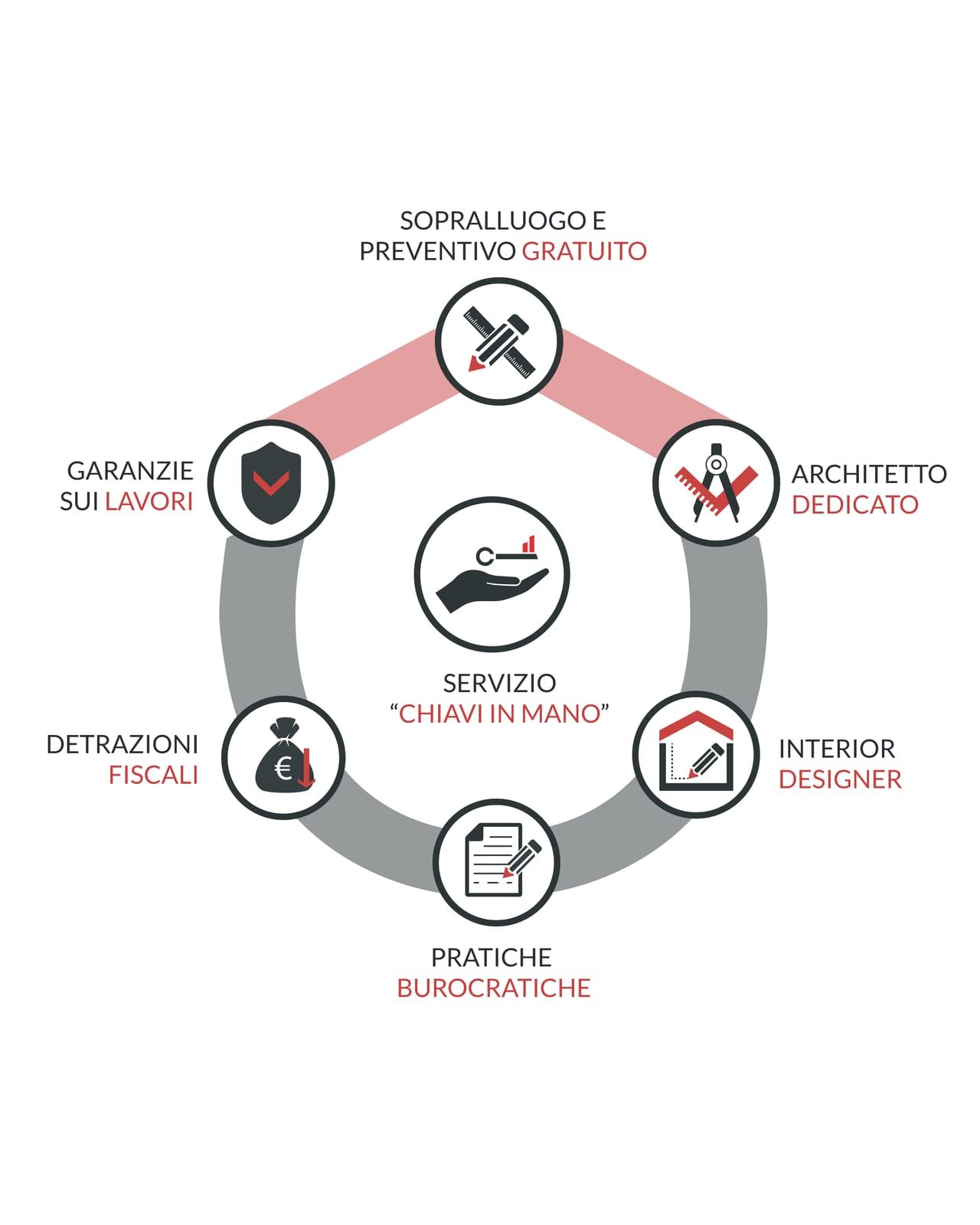
For the shop window we lined up the seven points a customer wants to hear before walking in: free survey, dedicated architect, interior designer, paperwork, tax deductions, guarantees and a turnkey service.
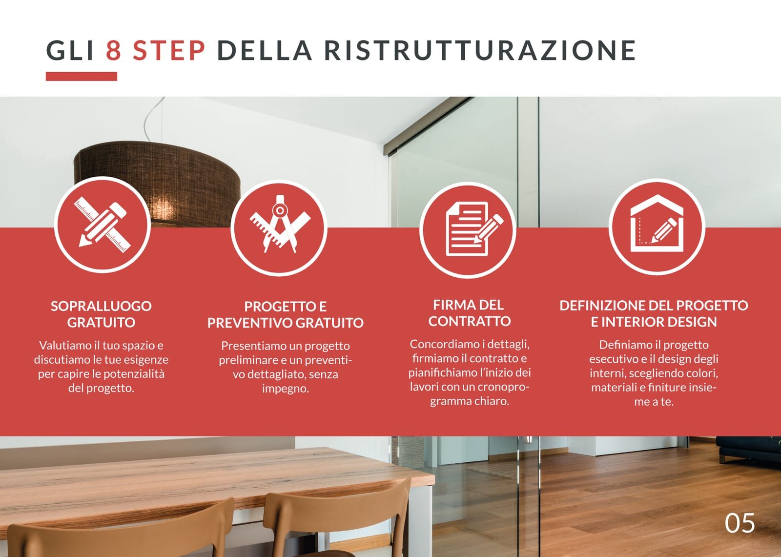
The heart of the brochure is the eight steps of a renovation, from survey to handover. What the customer really buys is the certainty of knowing what happens and when.
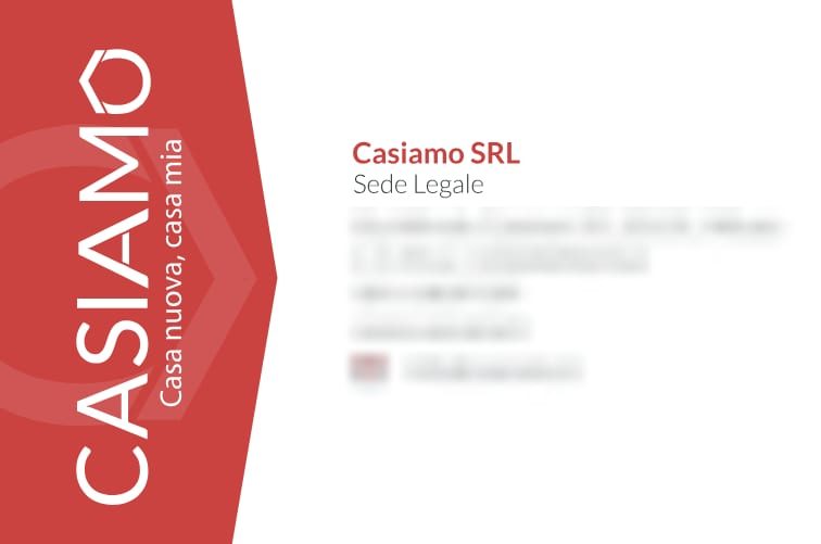
Front with the mark and payoff on the brand red, back with the company details on white. The blurred contacts are our choice for publication: on the real card they are there.
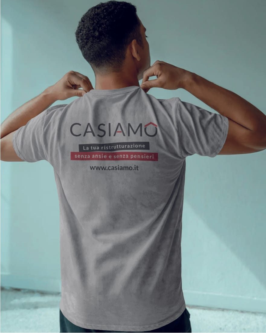
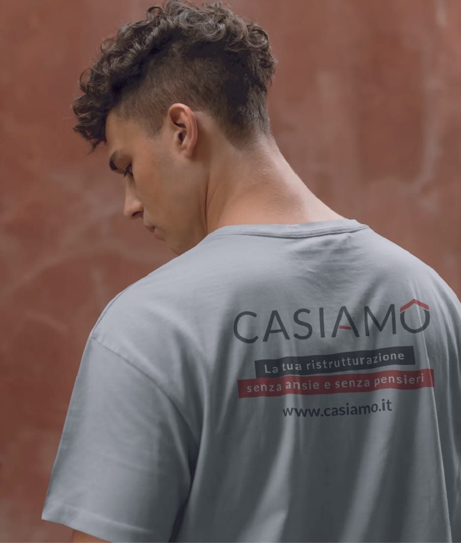
The mark on the chest and the extended version with payoff and website on the back. On site, the crew is the brand's most seen advertising.
We designed the look and behaviour of the pages and presented them on Figma, comparing three versions of the home slider.
Visit the site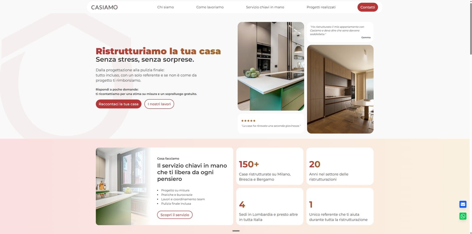
The site was developed by William Bardon, a freelance web designer who works with us. We designed the interface and handled the rest of the identity, while he built the site and put the step by step quote calculator online.
William's site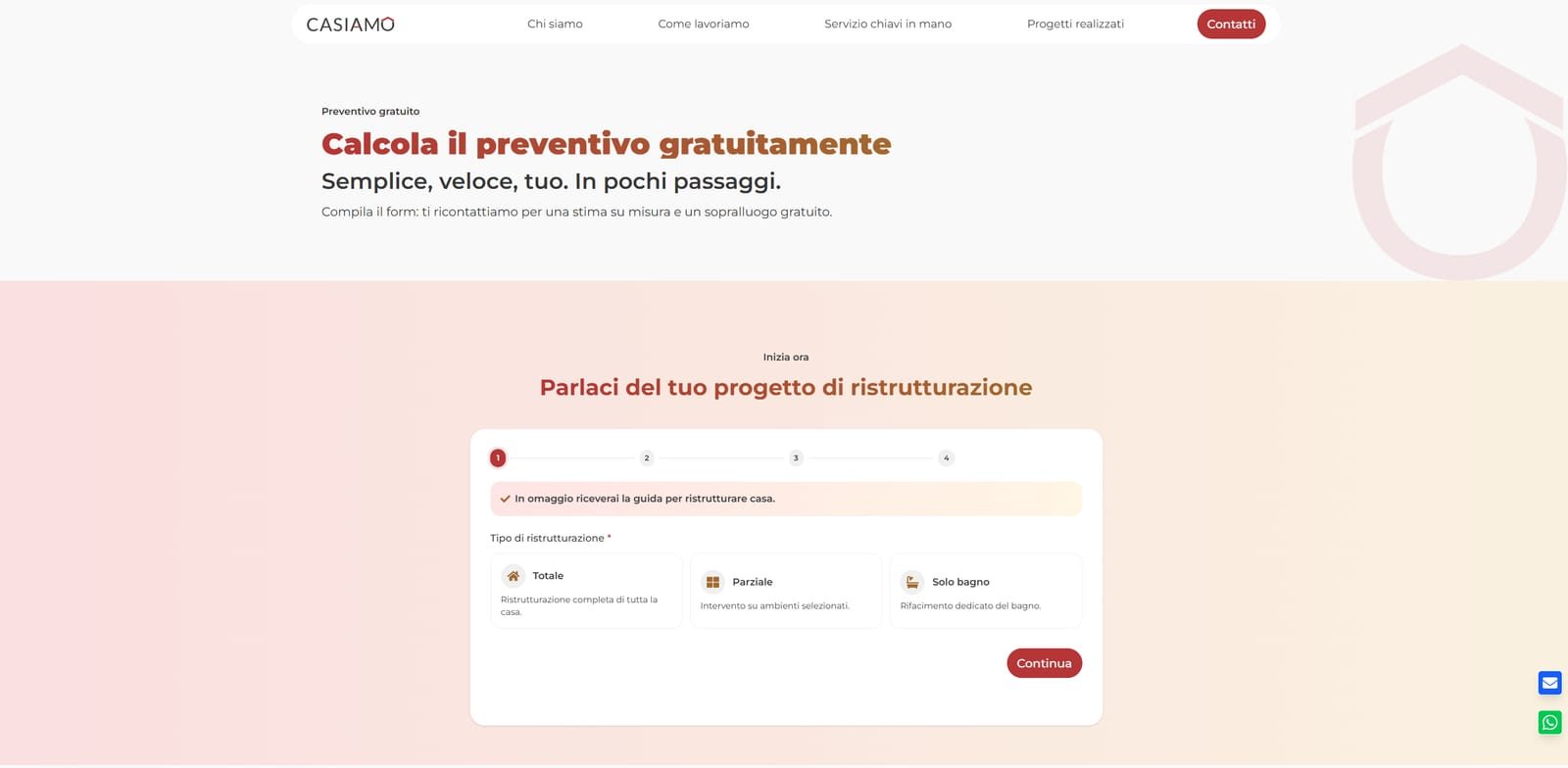
The process
Study of the old logo's weaknesses and of direct competitors.
Colour definition and four different directions for the pictogram.
The key head replacing the O, light and dark variants, brand pattern.
From metaphors to six final options, down to "Casa nuova, casa mia".
UI presented on Figma, with three slider versions. Brochure, business cards, window graphics, t-shirts and icons.
Typography
Casa nuova, casa mia
Aa Bb Cc Dd Ee Ff Gg Hh Ii Jj Kk Ll Mm Nn Oo Pp Qq Rr Ss Tt Uu Vv Ww Xx Yy Zz
Colour palette
Rosso Casiamo
#B53536
Grigio scuro
#3D3D3D
Bianco
#FFFFFF