The mark
The V of the name crossed by horizontal lines recalling the floors of a building and its lit windows. The initial stops being a letter and becomes a sign that speaks of homes.
Vittoria Real Estate Srl

The project
Vittoria Real Estate is a Milan estate agency that wanted to come across as a solid partner, in a field where trust is everything, but its image did not say so. They asked us for a whole identity, not just a logo: a mark, the rules to use it, and the materials the agent brings to appointments.
The mark starts from the V of the name, but it is not just a letter: the horizontal lines crossing it recall the floors of a building and its lit windows, turning the initial into a sign that speaks of homes. The palette sets a deep green beside a warm gold, to say reliability and value without shouting, with white for breathing room. The typography pairs Playfair Display, which carries the tone, with Raleway, which keeps long text readable. The manual defines clear space, minimum sizes and permitted uses, so the mark stays itself even when someone else applies it. From there came folders, postcards and business cards.
What we made
The V of the name crossed by horizontal lines recalling the floors of a building and its lit windows. The initial stops being a letter and becomes a sign that speaks of homes.
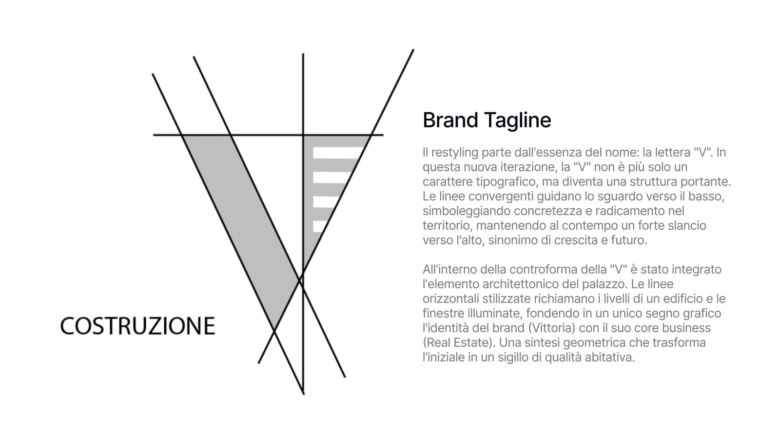
The mark is not drawn by eye: it comes from a grid, and every weight and angle has a geometric reason. That is what makes it possible to redraw it identically ten years from now.
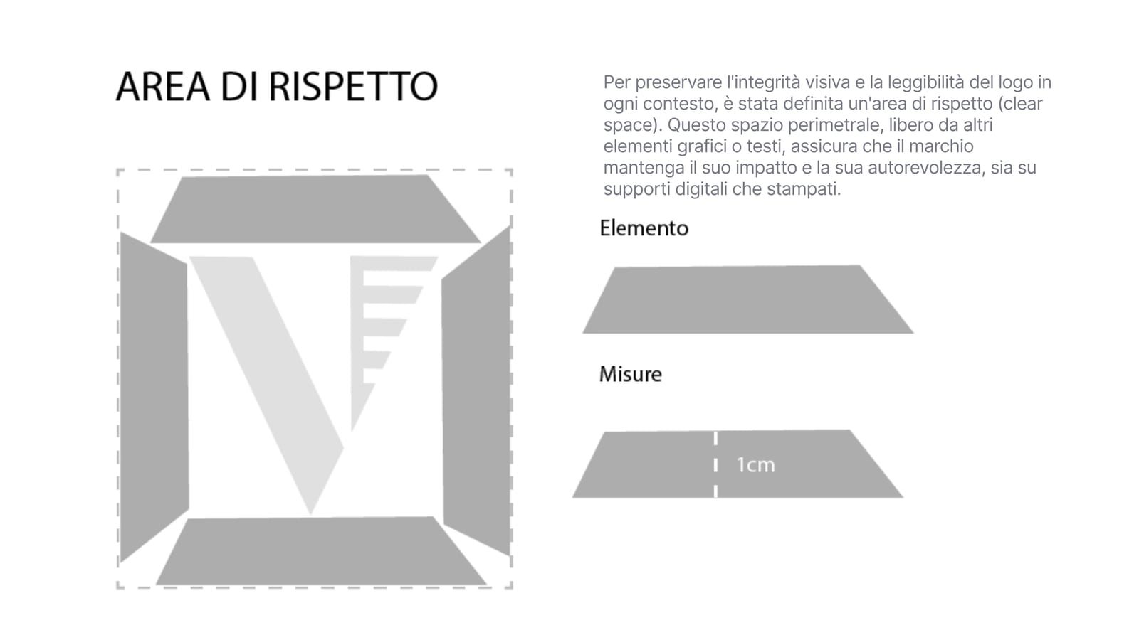
The minimum space that must stay free around the mark. It matters because the mark is applied by people who did not design it, and without a written rule it ends up squeezed against a headline.
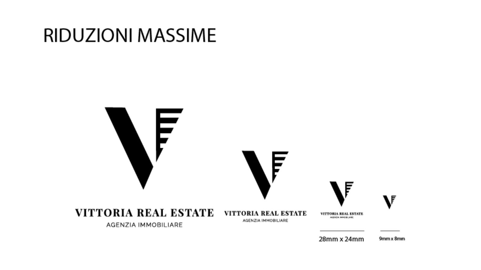
How small the mark can go and stay legible. Below a certain size the wording under the V disappears and only the letter is used: better a clean sign than unreadable type.
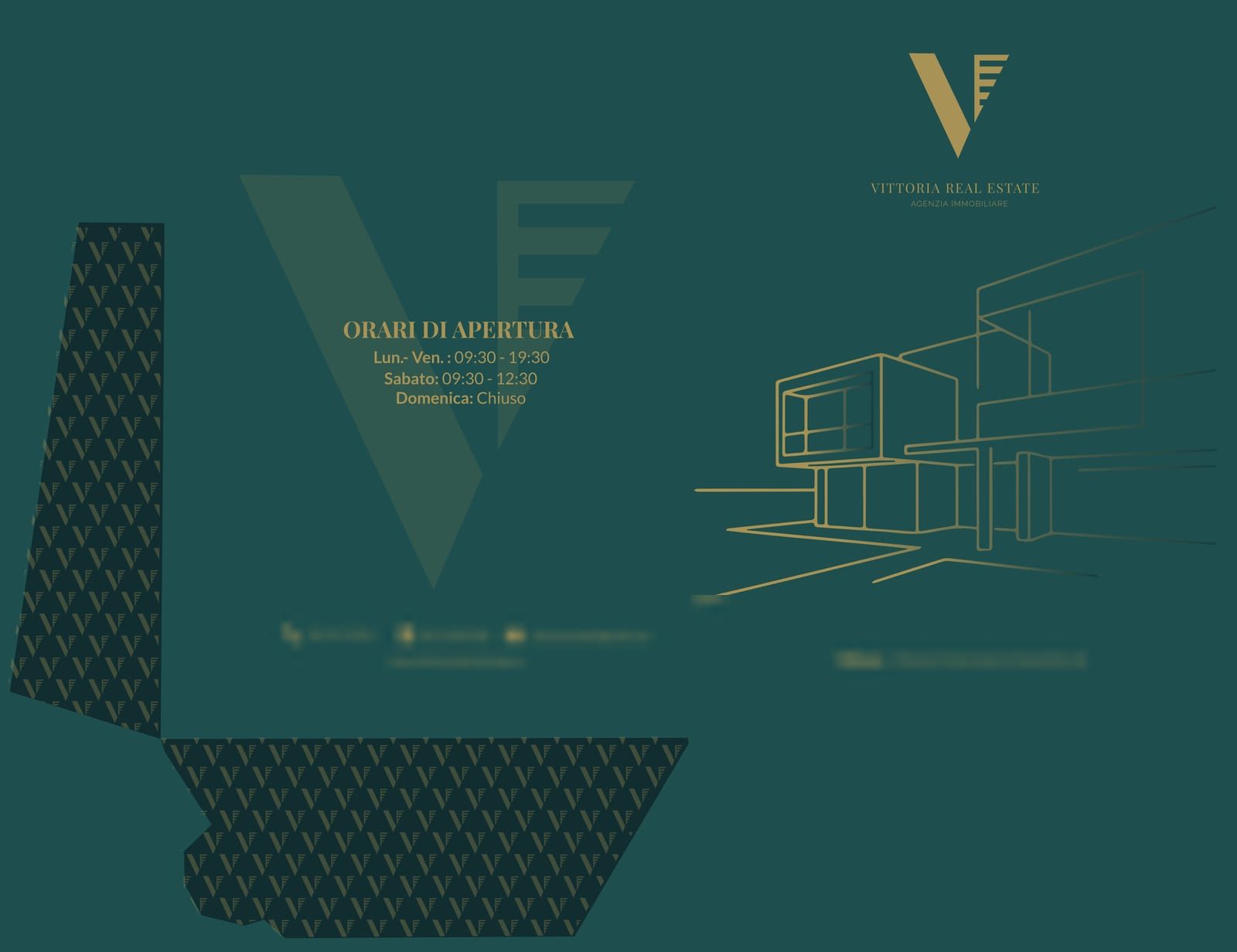
This is what stays in the client's hands after a meeting, with the proposal inside. Green background, gold mark, opening hours in evidence and a line drawing of a building filling the flap.
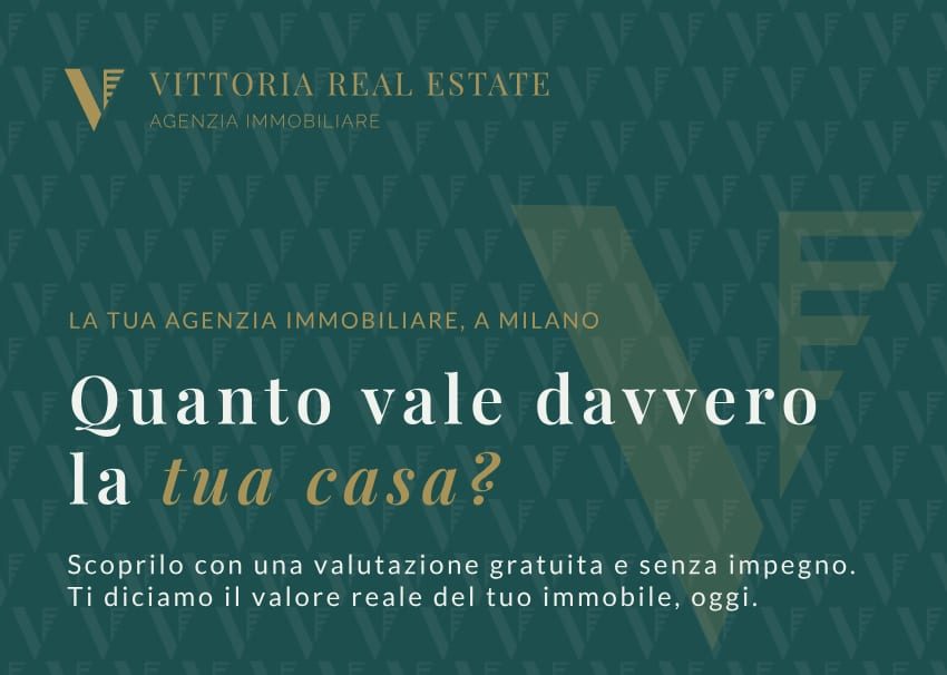
A tool to drop in a letterbox: one question, what is your home really worth, and on the back the offer of a free valuation.
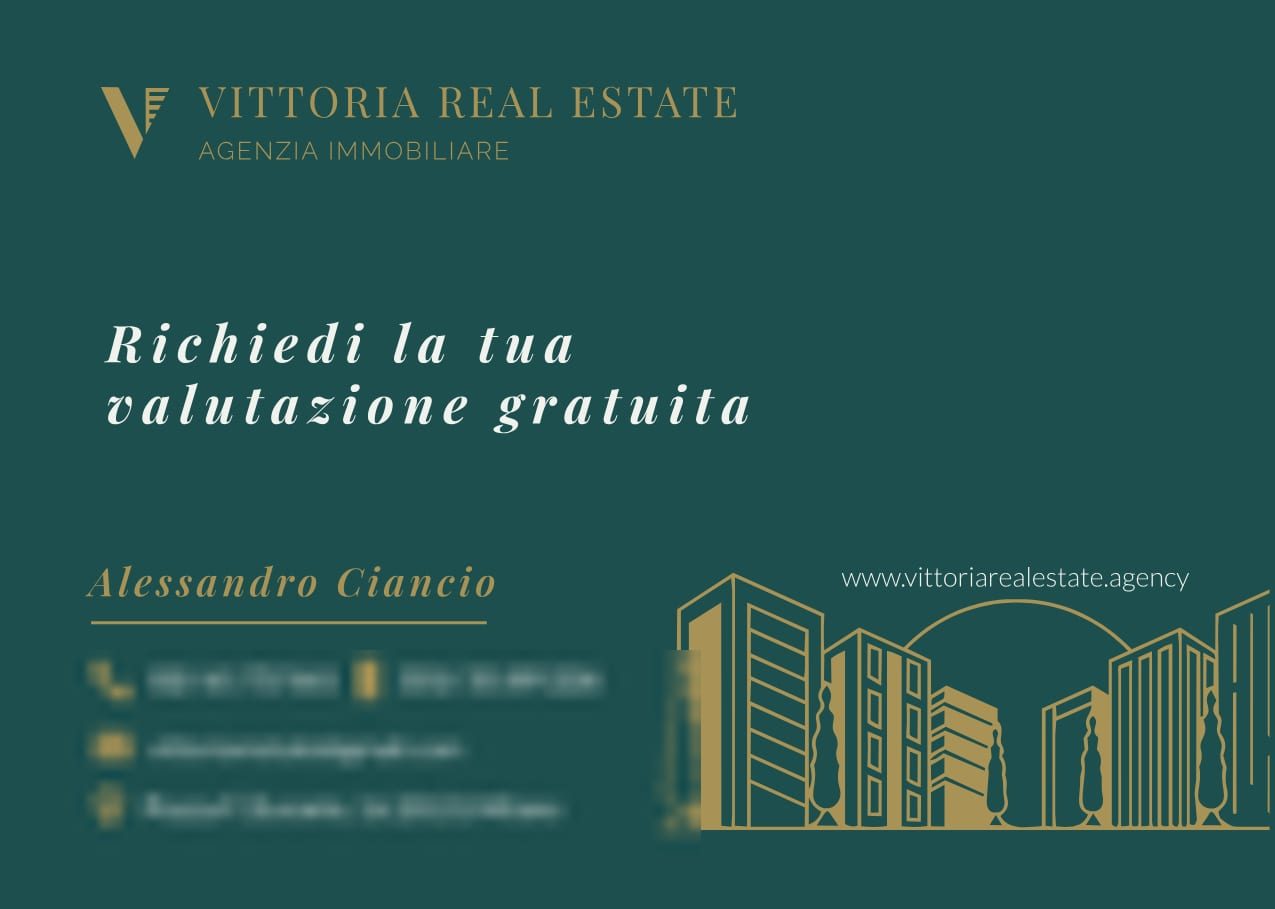
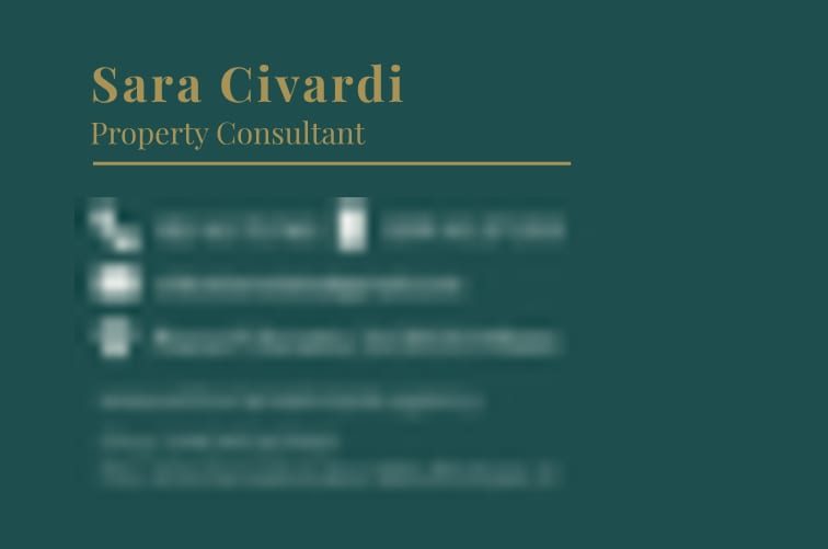
Front with the gold mark on green and the V pattern as a watermark, back with name, role and contacts ordered by importance.

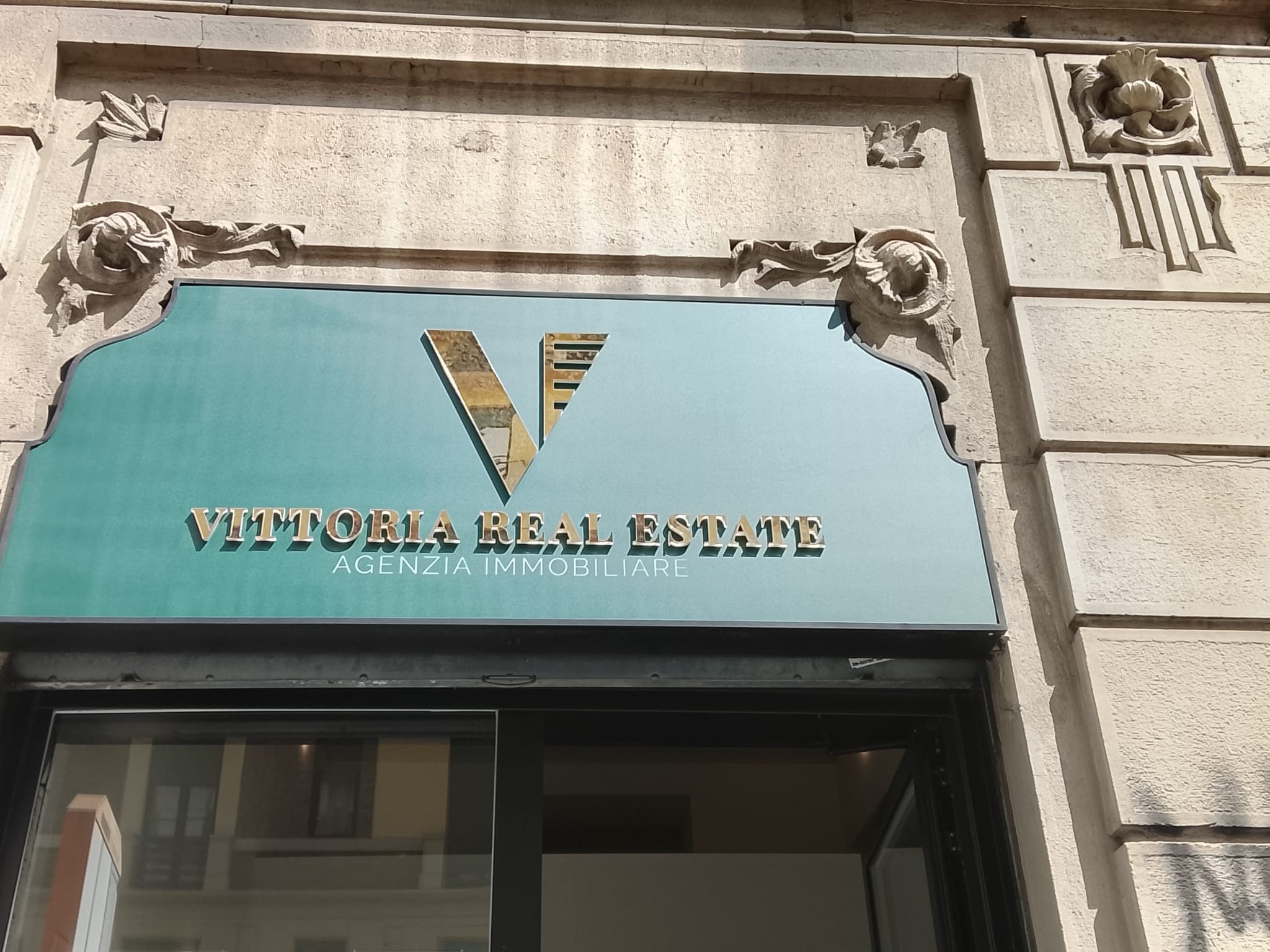
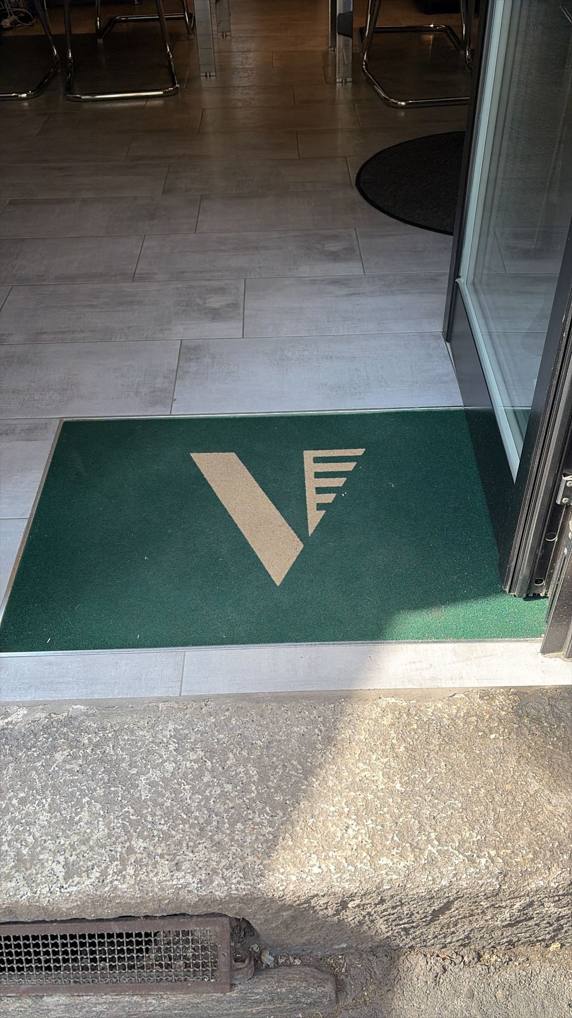
From paper to the street: the agency sign and the doormat at the entrance, where the brand stops being a file and becomes the first thing a client sees.
The process
From the letter V to an architectural symbol, drawn on a construction grid.
Green and gold, Playfair Display and Raleway.
Clear space, minimum sizes, correct use on every background.
Folders with flaps, postcards and business cards.
Typography
L'arte di abitare
Aa Bb Cc Dd Ee Ff Gg Hh Ii Jj Kk Ll Mm Nn Oo Pp Qq Rr Ss Tt Uu Vv Ww Xx Yy Zz
Agenzia immobiliare
Aa Bb Cc Dd Ee Ff Gg Hh Ii Jj Kk Ll Mm Nn Oo Pp Qq Rr Ss Tt Uu Vv Ww Xx Yy Zz
Colour palette
Verde Vittoria
#14453D
Oro
#C9A227
Bianco
#FFFFFF