EDDIDESIGN
CallWhatsAppGet a quote
Creative exercise · 2021

Concept for an appliance brand

Esercitazione accademica, LABA Brescia

Brand IdentityRestylingEsercizio
Concept for an appliance brand

The project

Brief

Style exercise, not commissioned. This is not work carried out for the brand shown and there is no relationship with it. Academic exercise produced at LABA in Brescia. The brief was to intervene on a very well known mark without overturning it, and to derive a full corporate identity from it.

The challenges

  • Altering a highly recognisable mark without making it unrecognisable
  • Tying the graphics to the actual product instead of decorating
  • A system holding up across paper, envelope, folder and presentations

The solution

The intervention is limited to the letter terminals, redrawn to echo the product shapes, in particular the work lamps. The original colours stay, because they are the most identifying part of the mark. For the materials a pattern was built from the grille of the air purifiers: an element that comes from the product rather than from decoration, and that holds business cards, letterhead, envelopes and folder together.

What we made

The pieces of the project

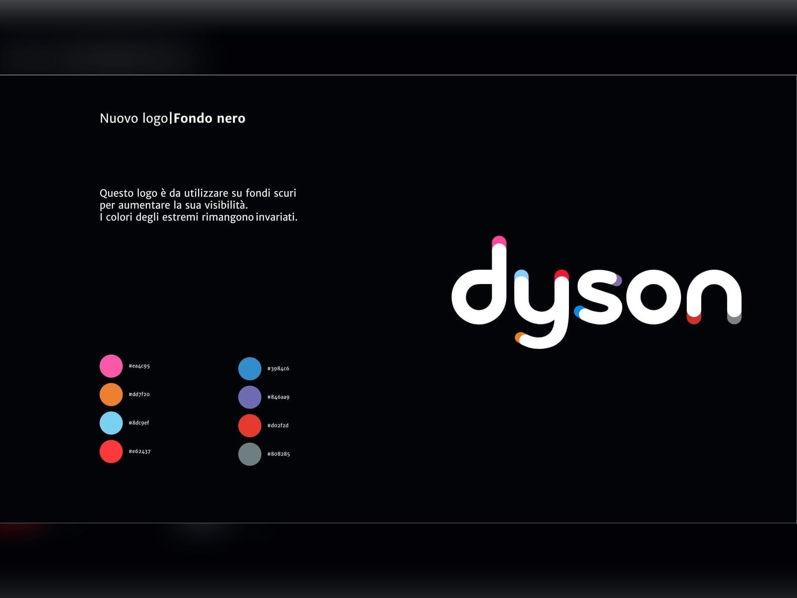
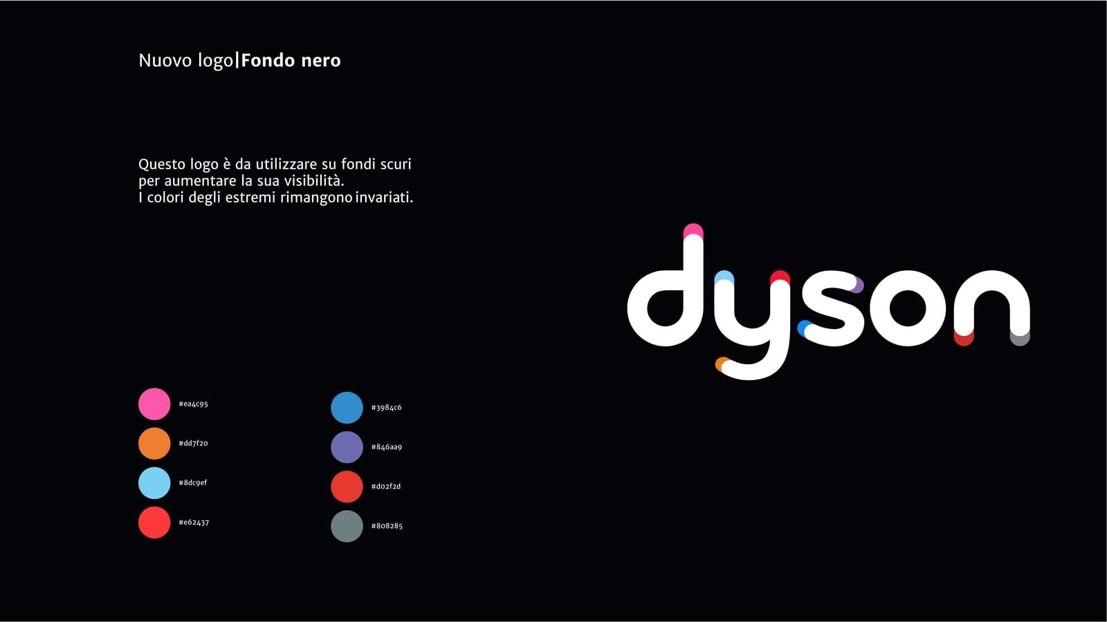
The redrawn mark

The intervention is limited to the letter terminals, redrawn to echo the product shapes, in particular the work lamps. The original colours stay, because they are the most identifying part, and on the dark background the coloured terminals gain weight.
The redrawn mark

The business cards

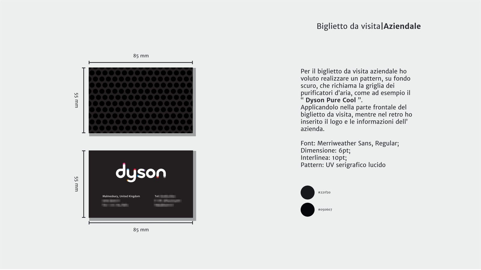
The pattern comes from the grille of the air purifiers: it comes from the product, not from decoration. On the company card it covers the whole front, on the personal one only part of it.

The business cards

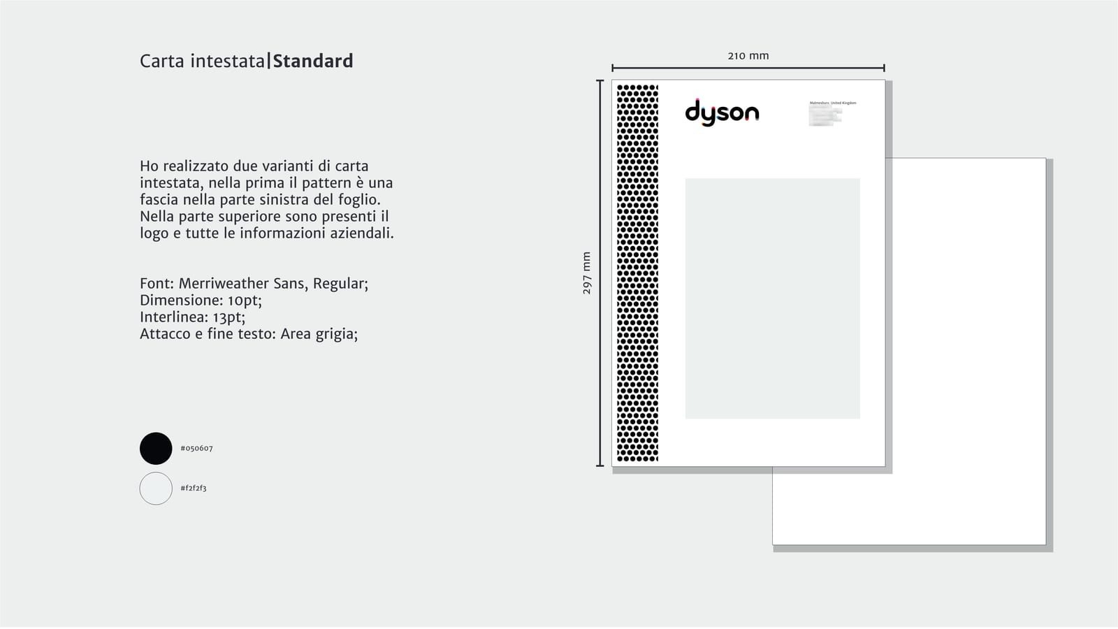
The letterhead

Two variants, with the pattern band on the left or at the bottom. The mark and company data at the top, with a defined text area so the layout does not drift.

The letterhead

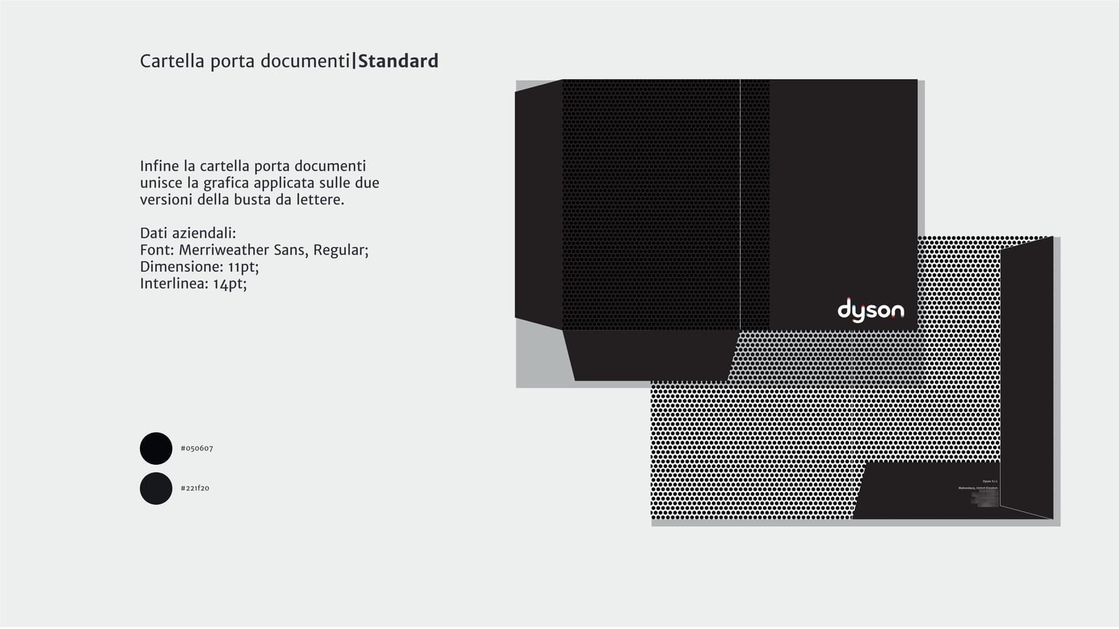
The document folder

It brings together the graphics applied to the other corporate identity pieces, so the package arriving at the customer is recognisable before it is opened.

The document folder

The process

Logo redesign

2021

Reworked the letterforms at the terminals, keeping the original colors.

Corporate identity

2021

A pattern drawn from the product, applied across print materials and presentations.

Degree in Graphic Design8+ years in the field5+ in-house jobs behind us46 projects35+ clients14+ websites live€15,000+ in gearCoffees: too manyPhotos taken: we lost countCameras: always one too many