Redrawing the mark
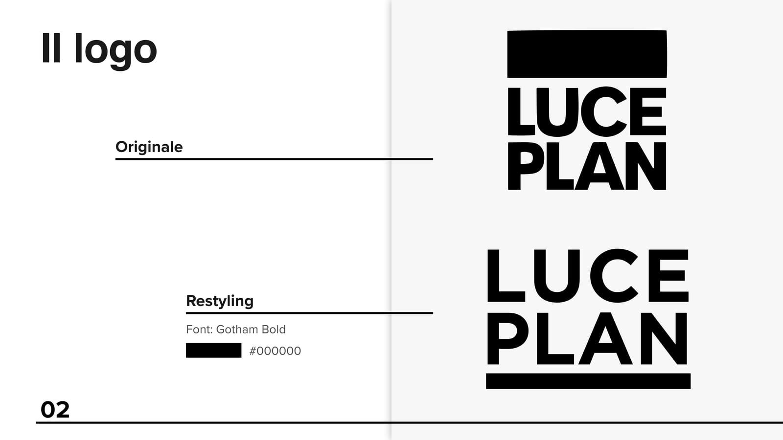
Original and restyling side by side. Letter spacing increases to improve legibility, and the solid block moves below the text, where it acts as a visual base and closes the mark.
Esercitazione accademica, LABA Brescia
The project
Style exercise, not commissioned. This is not work carried out for the brand shown and there is no relationship with it. This is the most extensive exercise of the group, produced during the Graphic Design & Multimedia course at LABA in Brescia in the 2019-2020 academic year. The brief was a full identity restyling for a historic lighting brand: mark, clear space, variants, business cards, letterhead, envelope, document folder, presentation templates, trade fair invitation and stand design.
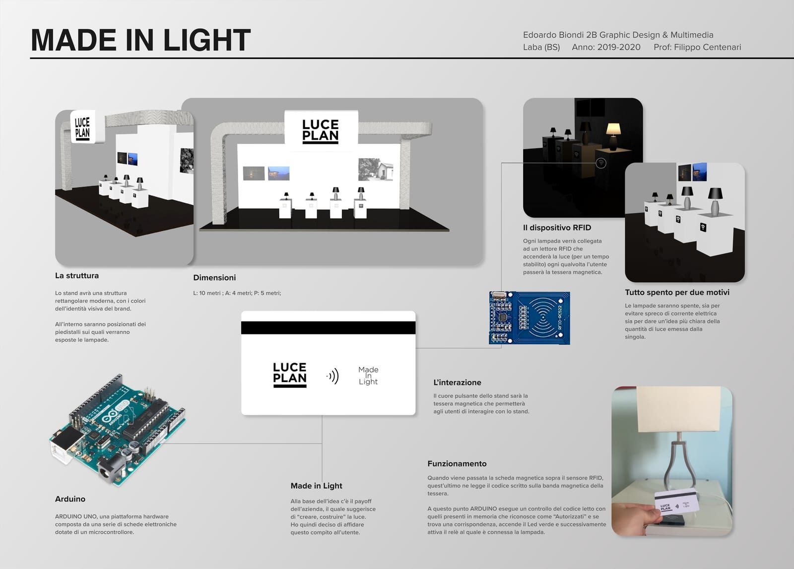
The redraw works on letter spacing, to improve legibility, and moves the solid block below the text, where it acts as a visual base and closes the mark. The clear space is built from the size of that block, so the rule comes from the sign itself rather than being imposed from outside. The trade fair stand is the freest part: a rectangular structure with plinths and lamps on display, and an interactive Arduino based device to let visitors experience the light instead of only looking at it.
What we made
Original and restyling side by side. Letter spacing increases to improve legibility, and the solid block moves below the text, where it acts as a visual base and closes the mark.
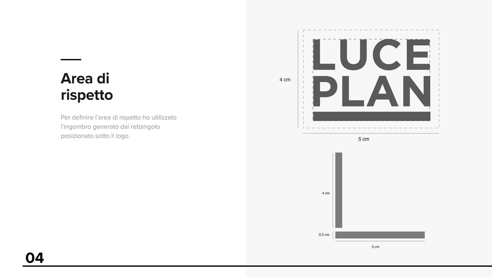
Built from the size of the solid block: the rule comes from the sign itself rather than being imposed from outside, so it holds at any size.
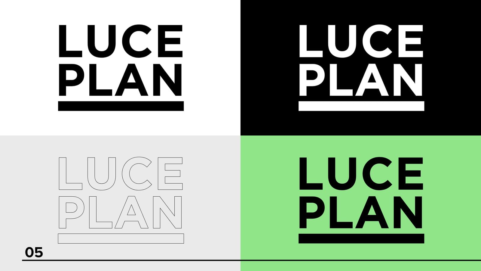
Positive, negative and the versions for difficult backgrounds. A mark that lives on lamps, catalogues and stands has to work everywhere.
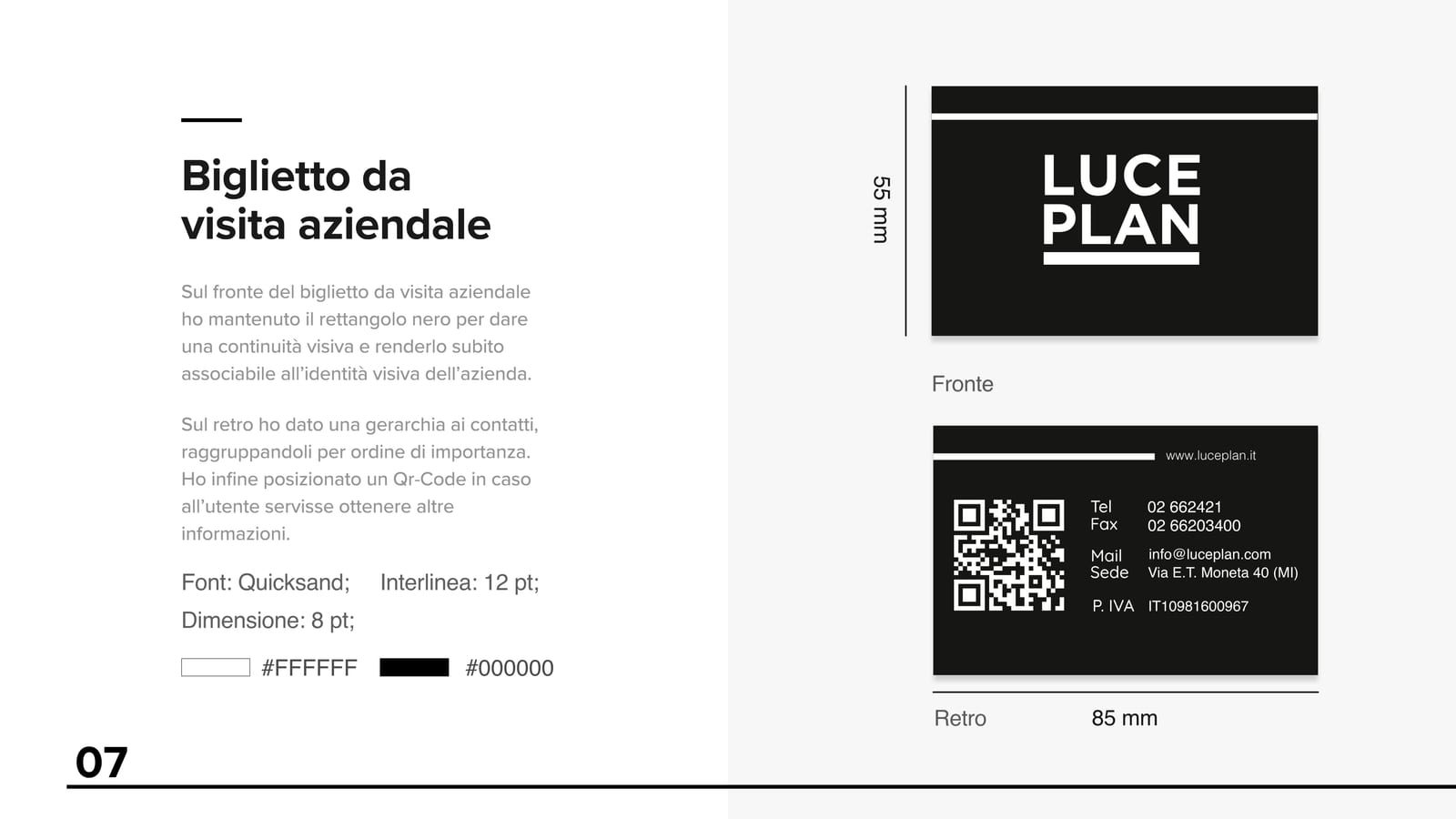
Front with the black rectangle for visual continuity, back with contacts grouped by importance and a QR code for anyone wanting more.
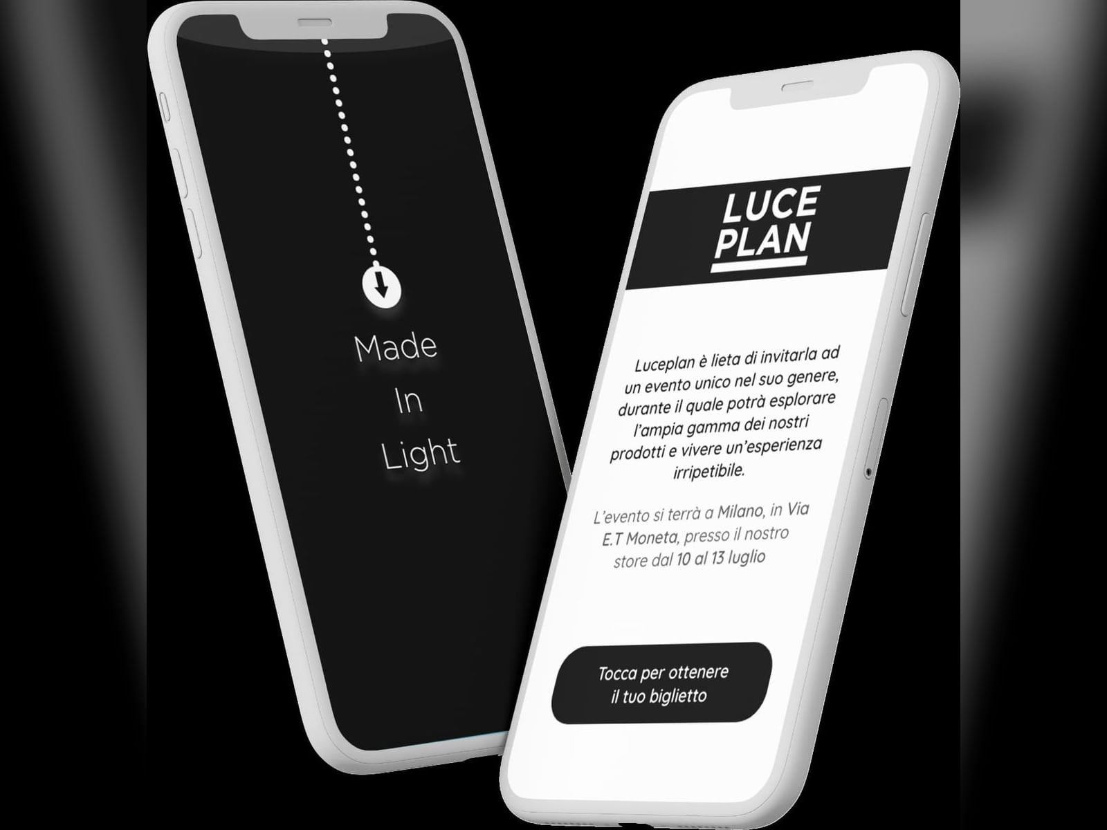
The digital version of the invitation, made to be opened on a phone. The movement of light acts as the graphic element.
A rectangular structure with plinths and lamps on display, plus an interactive Arduino based device to let visitors experience the light instead of only looking at it.
The process
Spacing, proportions and repositioning of the logo block.
Clear space, variants, print materials and templates.
Design of the exhibition space with an interactive display.