The pack
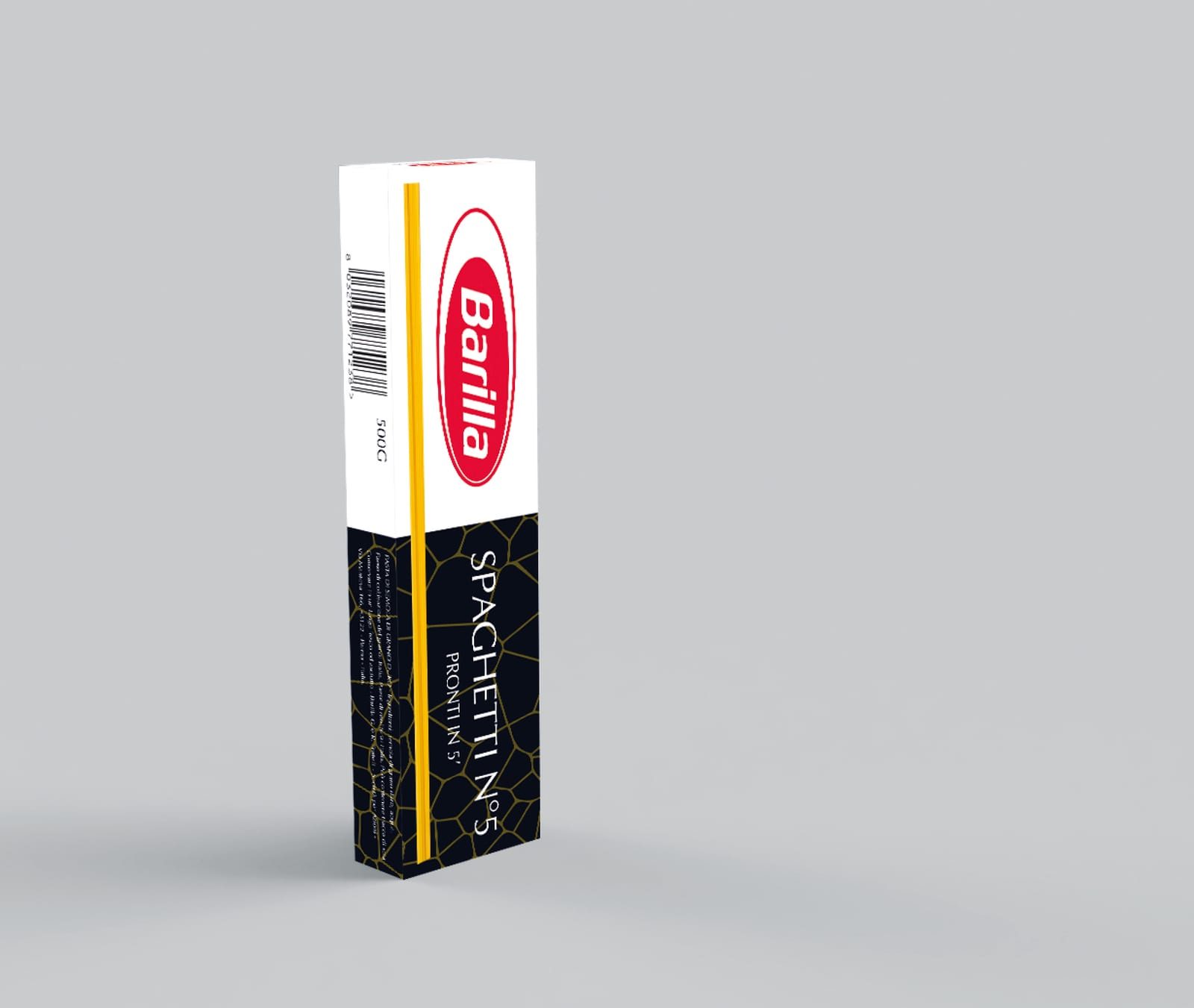
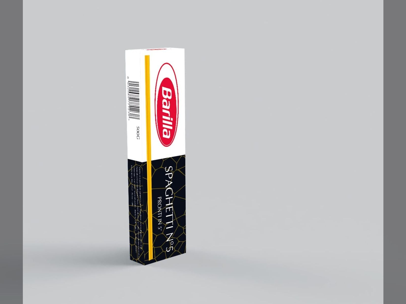
A limited edition version: darkened background and raised contrast against the reference yellow, keeping the mandatory information block where the shopper expects it.
Esercitazione accademica, LABA Brescia
The project
Style exercise, not commissioned. This is not work carried out for the brand shown and there is no relationship with it. A food packaging exercise: rethinking a very familiar box as a limited edition, working on the real die line and on print specifications.
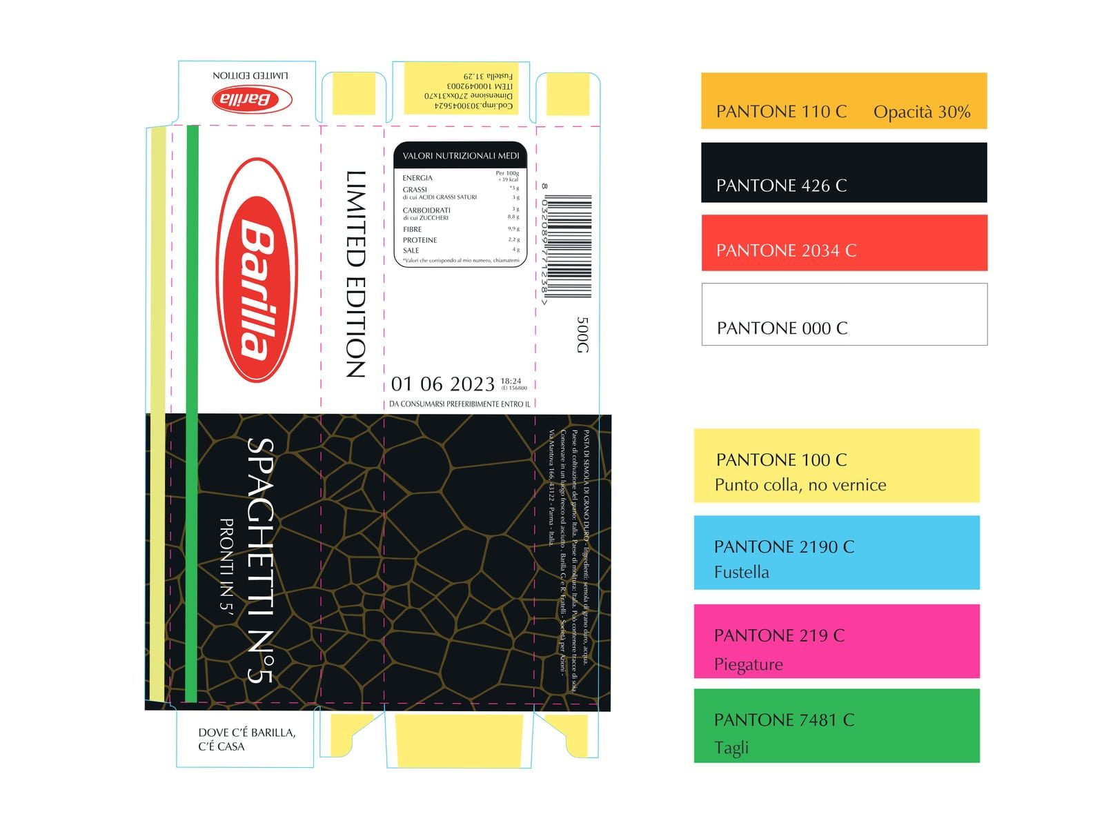
The project is built on the real die line, with folds, cuts and glue points marked, and on Pantone inks: that is the difference between a rendering and a file you could actually send to press. The limited edition version darkens the background and raises the contrast against the reference yellow, keeping the mandatory information block where the shopper expects to find it.
What we made
A limited edition version: darkened background and raised contrast against the reference yellow, keeping the mandatory information block where the shopper expects it.
The project is built on the real die line, with folds, cuts and glue points marked, and on Pantone inks. That is the difference between a rendering and a file you could actually send to press.
The process
Setup for folds, cuts, glue points and Pantone colors.
New background and hierarchy, with the mandatory information in its place.