EDDIDESIGN
CallWhatsAppGet a quote
Creative exercise · 2021

Label and flyer concept for a wine

Esercitazione accademica, LABA Brescia

PackagingStampaEsercizio
Label and flyer concept for a wine

The project

Brief

Style exercise, not commissioned. This is not work carried out for the brand shown and there is no relationship with it. An exercise on a wine product: label and flyer, with the Abruzzo landscape as a graphic starting point instead of a background photograph.

The challenges

  • A shelf where every label looks alike
  • Telling a territory without falling into the postcard
  • Consistency between the bottle label and the promotional material

The solution

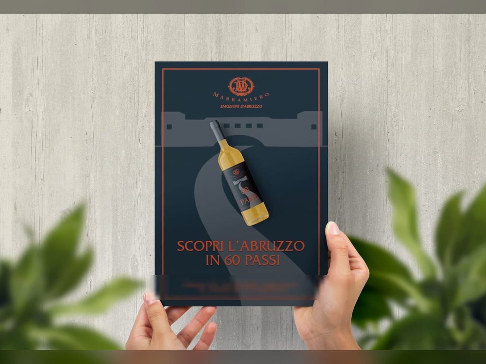
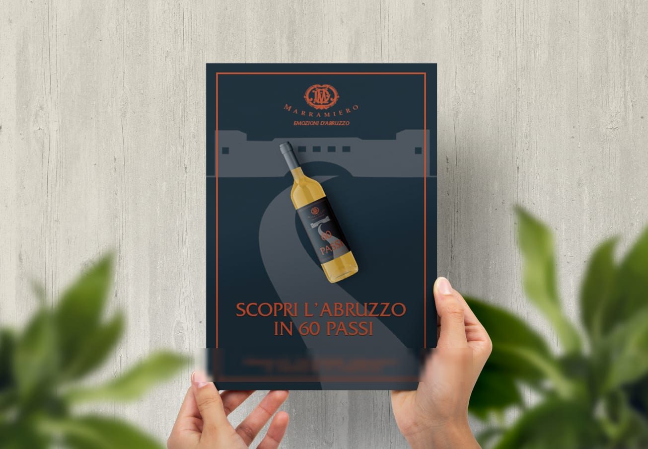
The landscape is reduced to a silhouette: the outline of the village and the road stretching to the horizon become a flat graphic sign, not a photograph. The bottle resting on the road ties the product to the place without having to explain it. The deep blue and orange are chosen to stand out on the shelf, where warm paper stock dominates.

What we made

The pieces of the project

The flyer

The landscape is reduced to a silhouette: the outline of the village and the road stretching to the horizon become a flat graphic sign, not a photograph. The bottle resting on the road ties the product to the place without having to explain it.
The flyer

The label

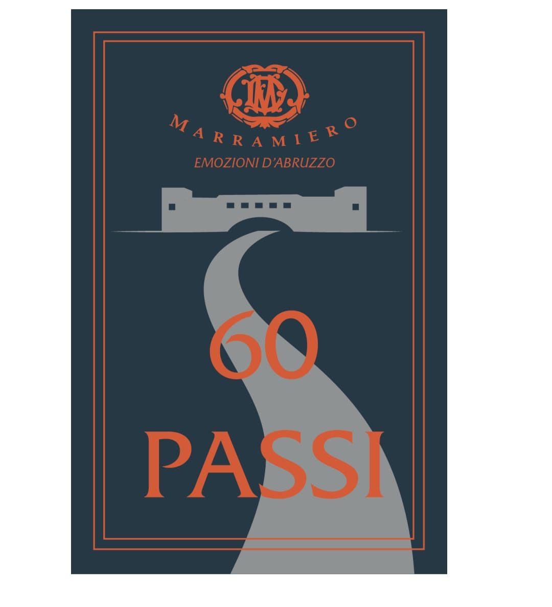
Deep blue and orange, chosen to stand out on a shelf where warm paper stock dominates. The same sign from the flyer returns small on the bottle.

The label

The process

Label and flyer

2021

A graphic system built on the outline of the local territory.

Degree in Graphic Design8+ years in the field5+ in-house jobs behind us46 projects35+ clients14+ websites live€15,000+ in gearCoffees: too manyPhotos taken: we lost countCameras: always one too many