The logo restyling
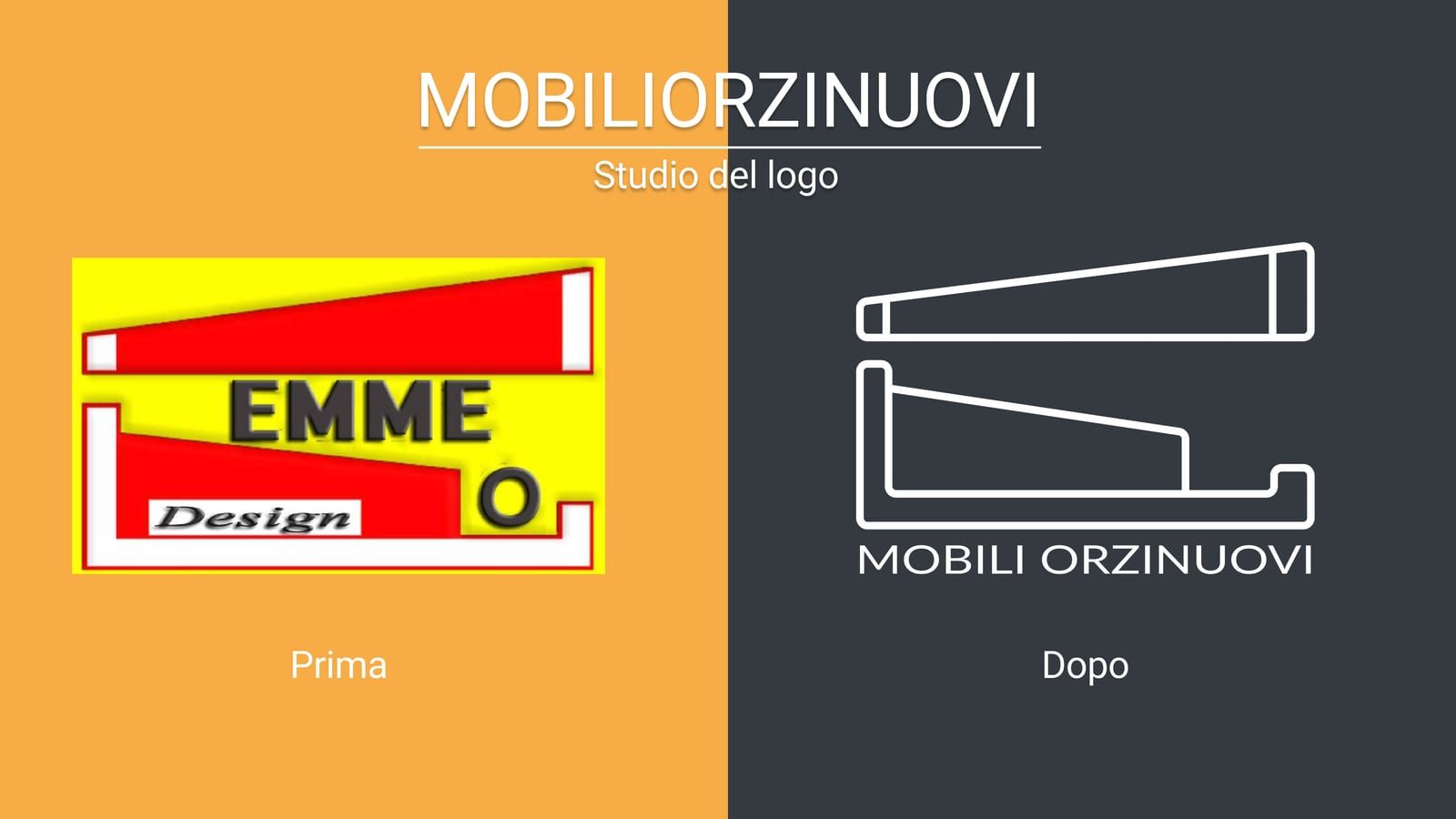
Before and after. From a yellow and red mark still reading EMME Design to a single colour line pictogram, legible even small and on any background.
Mobili Orzinuovi
The project
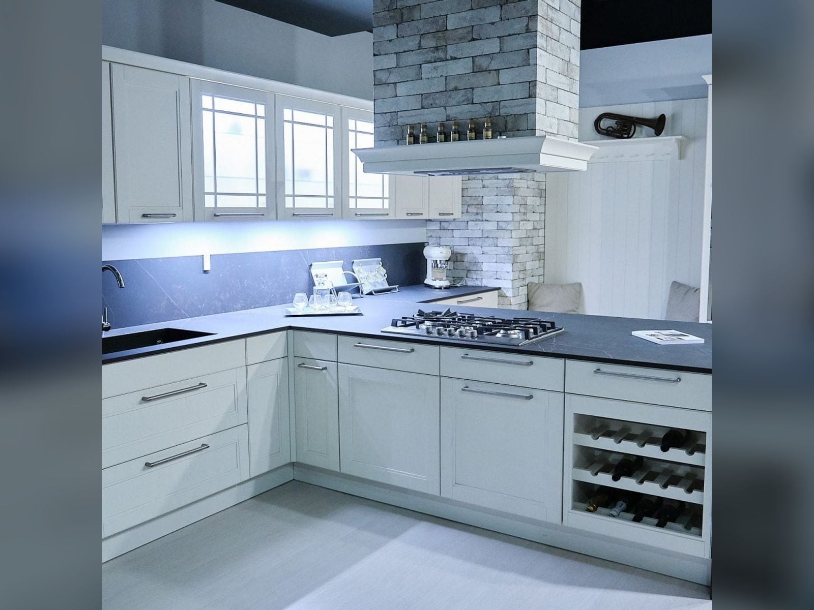
Mobili Orzinuovi has furnished homes for over forty years, but its image was stuck at the start: the old logo, yellow and red, dated the business instead of telling it. They asked us to modernise everything while staying recognisable, then the site, the business cards and the roadside billboard.
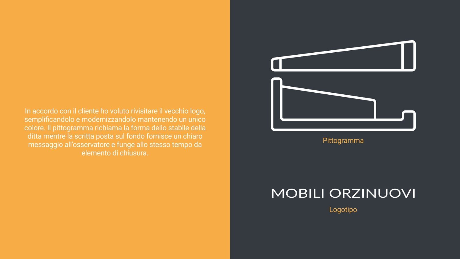
The new mark is a line pictogram that redraws the outline of the shop building, with the name underneath as a base. A single colour, so it works on any background, from the sign to the letterhead. The palette keeps a dark grey as primary and a warm orange as accent, with Roboto in three weights carrying everything. The site is a complete rebuild of the previous one, rethought around how people actually use it and optimised for the phone, where most visits arrive.
What we made
Before and after. From a yellow and red mark still reading EMME Design to a single colour line pictogram, legible even small and on any background.
The sign redraws the outline of the shop building. Anyone passing the store recognises their own town in the mark, and the name underneath closes the composition as a base.
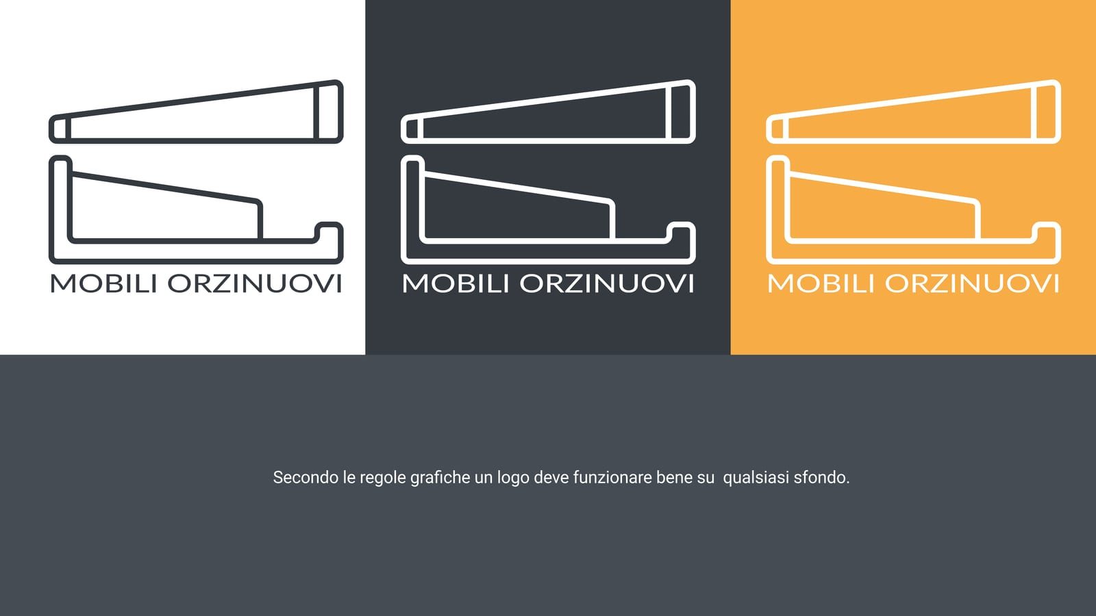
A mark has to work wherever you put it. We checked it on light, on dark and on the accent yellow, because between signage, paper and screen the background keeps changing.
A complete rebuild of the previous site, rethought around how people actually use it and optimised for the phone, where most visits come from.
Visit the site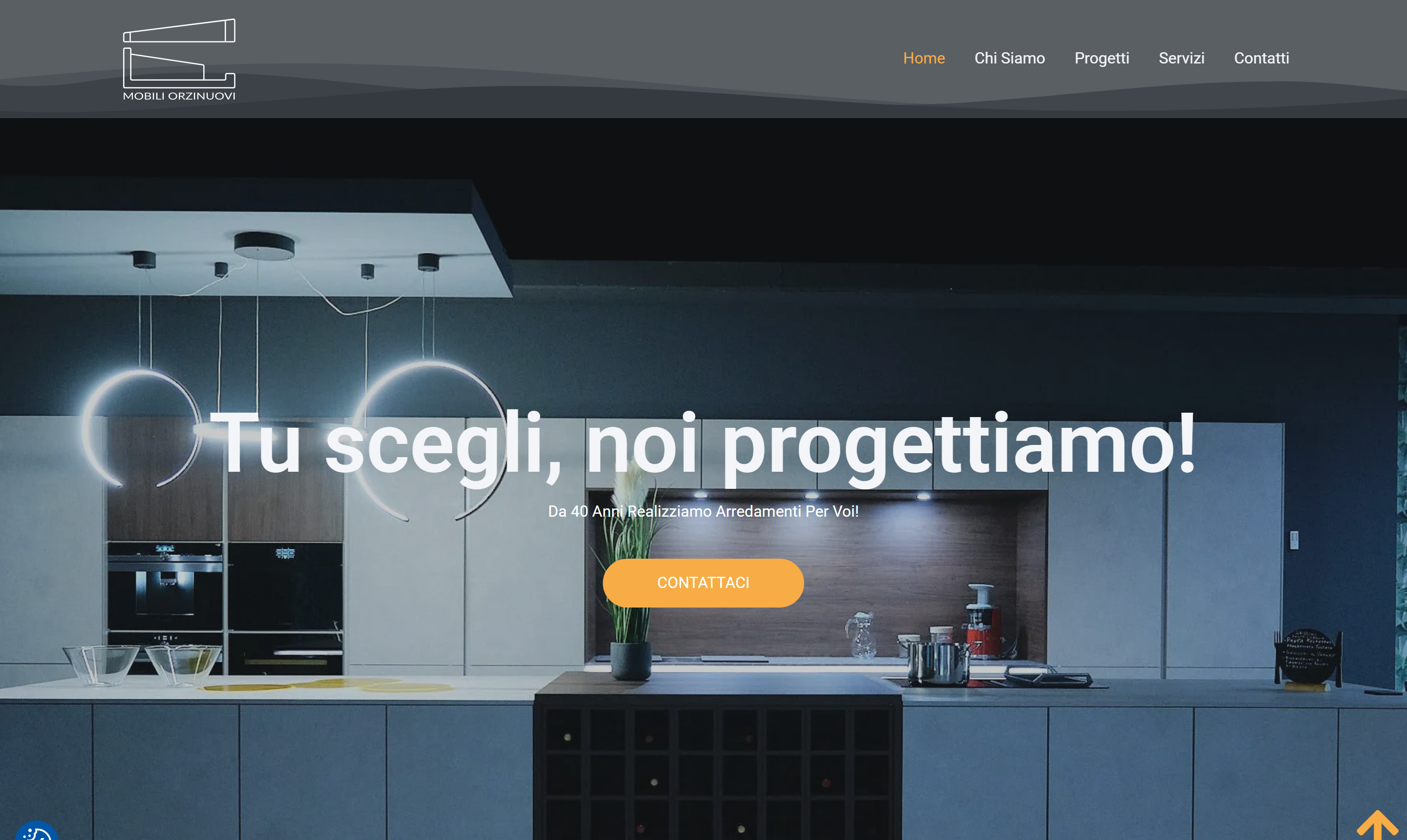
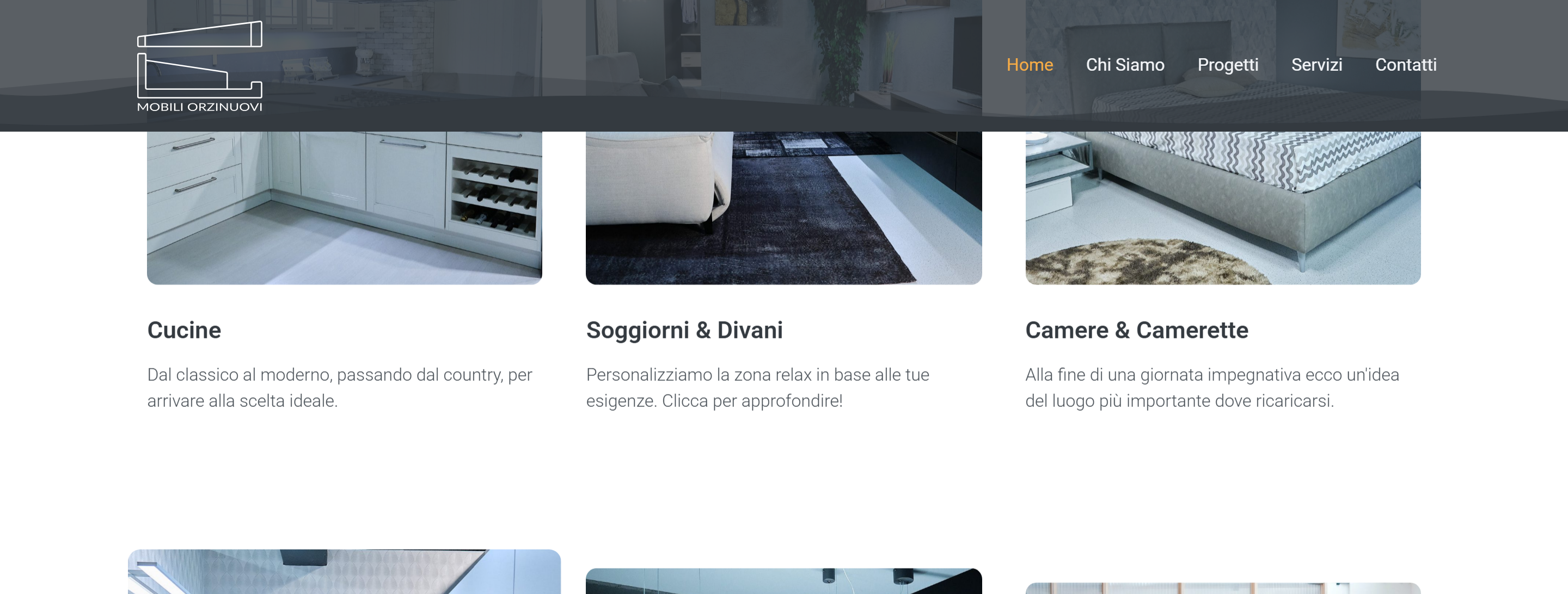
The furniture categories come in straight away, with large photographs of the rooms. Someone looking for a kitchen or a bedroom reaches the right section without getting lost.
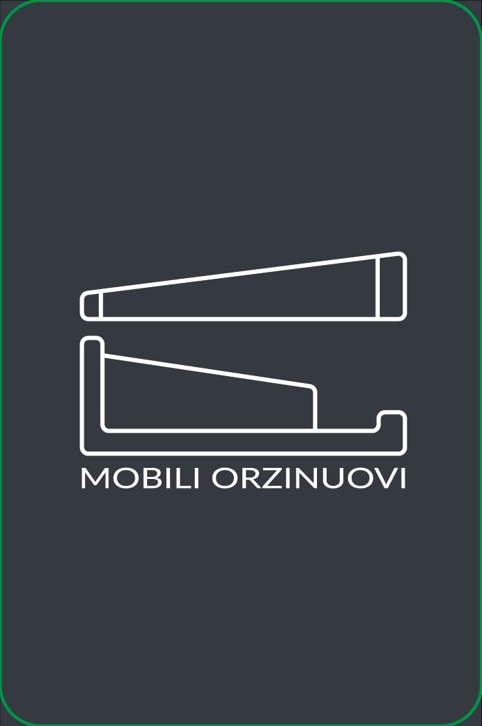
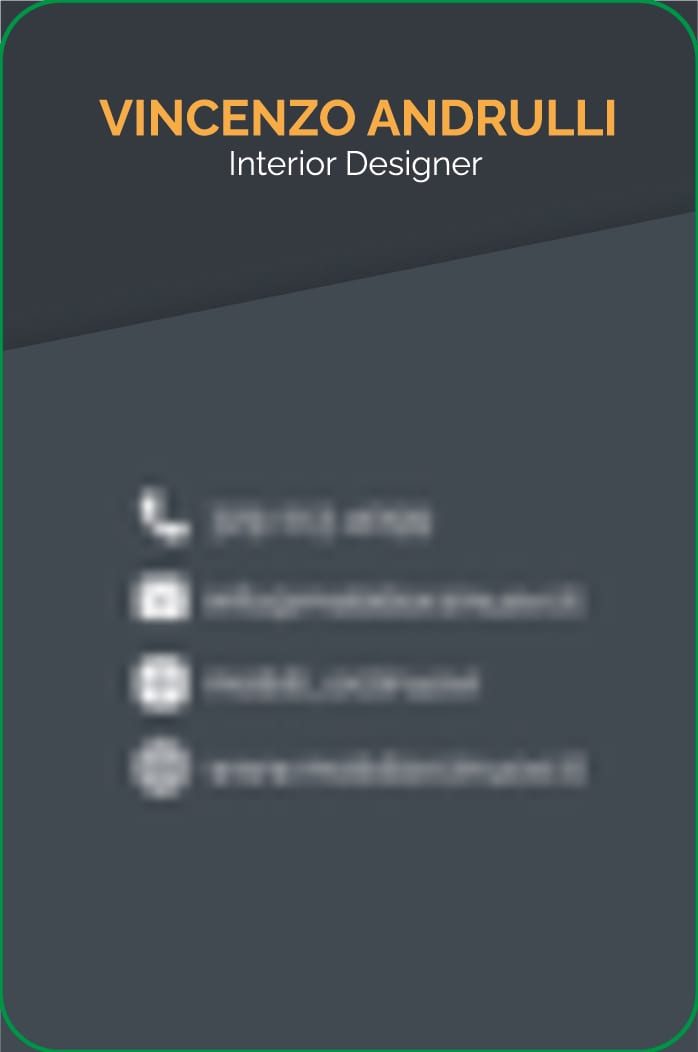
Dark front with the pictogram alone, back with name, role and contacts in a column. The green edge is the only decorative concession.
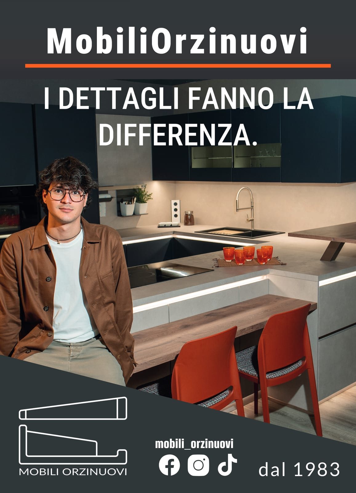
It reads in seconds from a passing car: one line, the mark, the founding year. "Details make the difference", with 1983 underneath as a reminder of how long they have been there.
The process
From the old EMME Design to a pictogram that echoes the building itself.
Roboto Light, Medium and Bold. Dark grey, white and orange.
A complete rebuild, with careful user experience work and mobile optimization.
Business cards and a roadside billboard.
Typography
Tu scegli, noi progettiamo
Aa Bb Cc Dd Ee Ff Gg Hh Ii Jj Kk Ll Mm Nn Oo Pp Qq Rr Ss Tt Uu Vv Ww Xx Yy Zz
Colour palette
Primario
#343A40
Secondario
#FFFFFF
Evidenza
#F7AC46